
Screenshots that match your theme
The site has Light, Dark and Auto themes. Until now, a screenshot in a post had one version for all three. On a dark page, a light screenshot is the brightest thing on the screen, and it glares.
Our Daybreak article shows the problem. Its GitHub commit history is a light capture. This is that figure in the site's dark theme before the change:
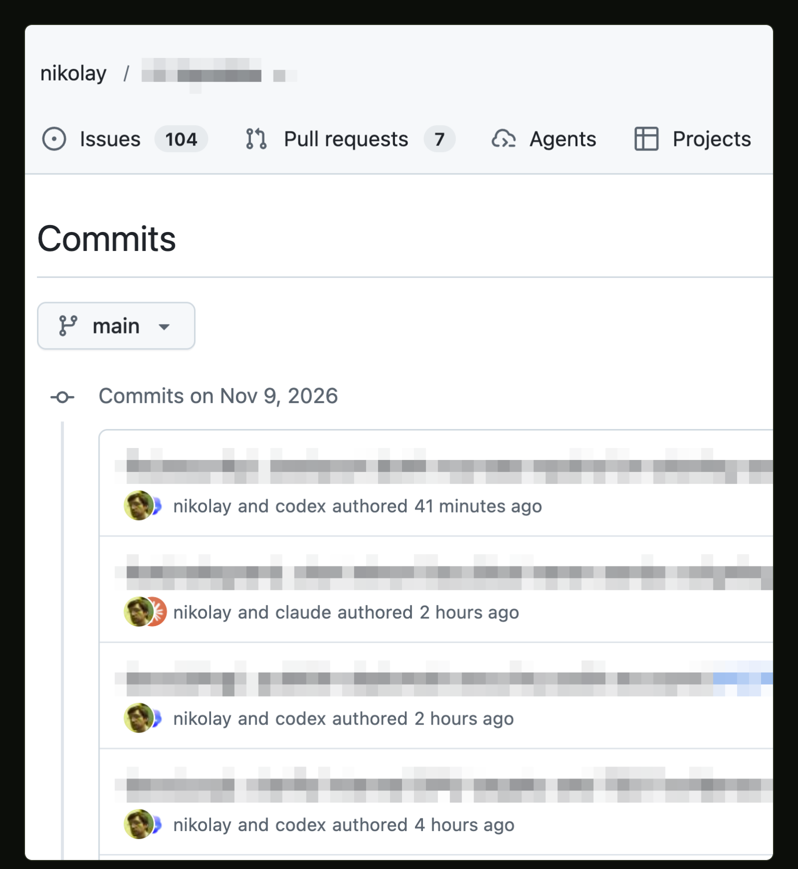
Before: a local build of main before this change. Captured on November 13,
2026, in Playwright's Chromium at 2×, with the site's Auto theme on a dark
system. The figure shows the light capture from November 9.
A post image can now carry a light and a dark version. This is the same figure after the change, captured with the same viewport and clip:
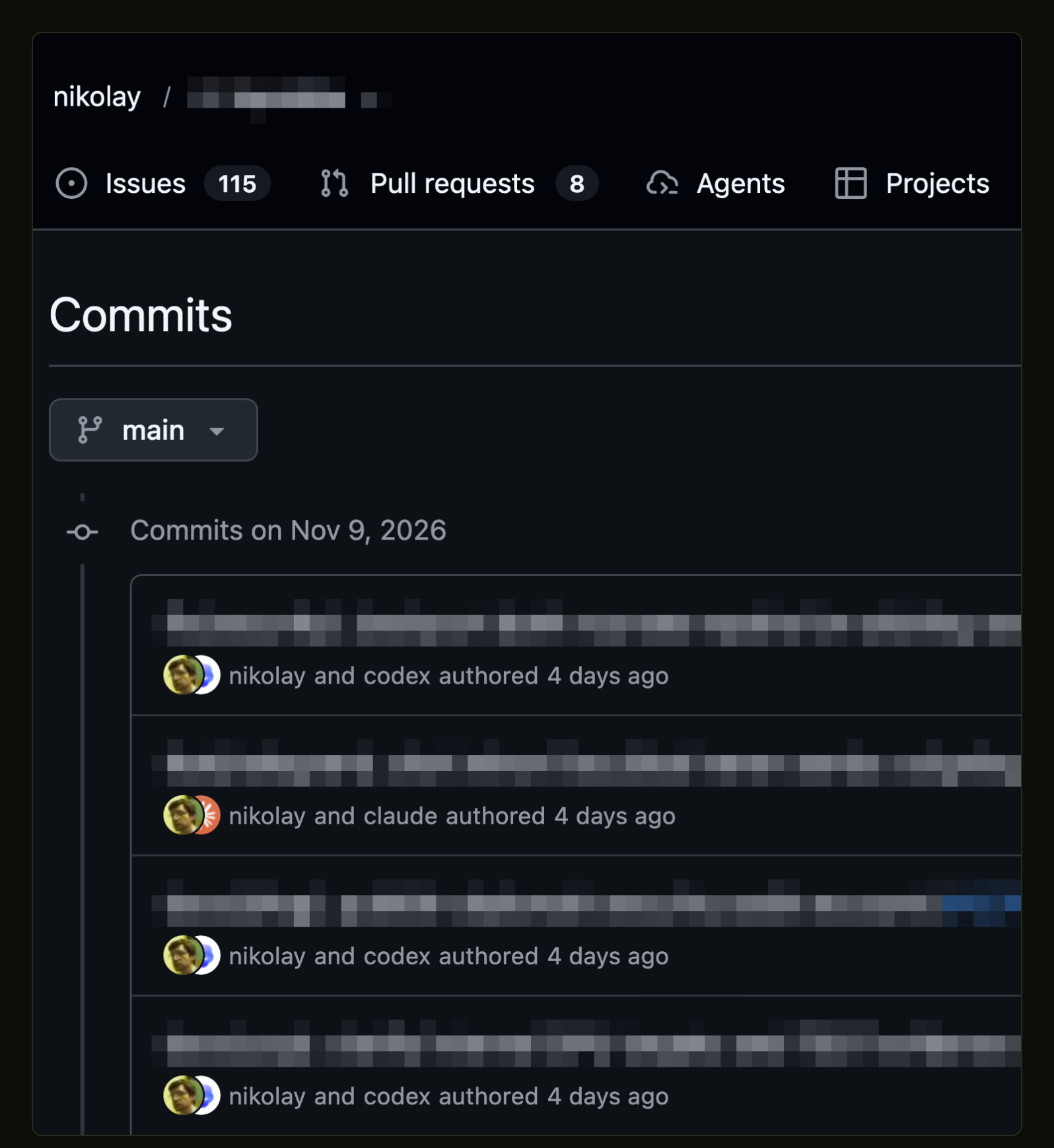
After: a local build with the dark versions added. Captured the same way on November 13, 2026. The figure shows a dark capture of the same GitHub page from November 13, with the same fields pixelated.
View full-size PNG (1596 × 1738)How a post names a version
A media entry in the post's front matter names the versions:
media:
  /blog/images/daybreak-enrollment.png?v=3f3dbddf3f45:
    display_width: 488
    dark_src: /blog/images/daybreak-enrollment-dark.png?v=83782b5059ad
The image in the post body stays the default. The light theme shows
light_src, the dark theme shows dark_src, and a theme without its own
version shows the default. Feeds, the newsletter, the Markdown copy of each
post and structured data have no theme, so they use only the default image.
A version must have the same format, width and height as the default, so one set of dimensions fits both. The build also refuses a version that the site would not serve, such as a file outside the published images directory.
Why a picture element was not enough
HTML already has a way to choose an image by color scheme: a <picture>
element with a <source media="(prefers-color-scheme: dark)">. That media
query follows only the operating system's setting. It ignores the site's own
theme control. A reader who picks Light on a dark system would still get the
dark image.
So a themed figure contains one image link per theme. The site's theme
stylesheet already sets two display tokens, --mark-dark-display and
--mark-light-display, in each of its three states. The sign-in buttons use
them to switch between dark and light artwork. The figures use the same tokens,
so they follow the theme control without a new script. Without JavaScript,
the figures follow the system setting.
Each link points to its own image, so the image viewer opens the version that is on screen. No script swaps addresses when the theme changes.
Only the shown version downloads
The hidden version has display: none. That removes it from the tab order
and the accessibility tree, but an eagerly loaded image still downloads.
Every image in a themed figure therefore loads lazily, and browsers do not
fetch a lazy image that is not displayed. In the build behind the after
capture, the page requested one file for that figure: the dark version. In
the browser checks for this change, Chromium and Firefox also skipped the
hidden version in each theme state. Switching the theme loads the newly
visible version on demand.
The cost is priority. The first figure in a post normally loads eagerly with high fetch priority. A themed first figure loads lazily, like the rest.
Each version is a real capture
A dark version must be a native capture of the real page in its dark theme. We never invert, recolor or filter a light screenshot to make one. An inverted screenshot does not show what the page looked like. GitHub's dark theme has its own grays and accent colors; it is not the light theme inverted. Inversion would also turn photos and avatars into negatives.
A dark version keeps the light version's crop and pixelates the same fields. The pixelation comes from the dark capture's own pixels: each square takes the average of its native pixels. The squares are 24 pixels, or 12 in both OVHcloud versions, where 24-pixel squares looked like a flat bar on the dark background. The screenshot registry lists each version as a separate screenshot with its source hash. Before publication, the checker recomputes every pixelated square from the private original.
A real capture also records its own date. The dark GitHub and ChatGPT screenshots were captured on November 13, four days after the originals. GitHub now says "4 days ago" where it said "41 minutes ago", and its tabs count 115 issues and 8 pull requests instead of 104 and 7. The article's evidence note and captions say which date each version shows.
What this does not cover
The console page in the Daybreak article's original OVHcloud screenshot has no dark theme: with a dark system setting, it stays white. So both versions of that screenshot were recaptured on November 13 from OVHcloud's newer console, which has a dark theme. Its caption says which console it shows.
Older posts keep their single image until someone captures a real dark version. A version is optional, and a theme without one shows the default.
The before and after captures above both show the dark theme, so they have no light versions of their own.


Comments
Comments are reviewed before publication. The Author badge marks replies from the author.
Your test session has expired. Stop testing to use comments and sign-in normally, or open a fresh test link to keep testing.
Stopping testing reloads this page in normal mode.
Read approved comments on the discussion page.
Open the discussion page